-
Posted: April 19, 2021Categories: InformationalRead more »
There are many flags. There are flags for nations and flags for nation-states. There are flags for cities and counties and flags for provinces and principalities. There are flags for social justice and for groups that fight for social justice. There are flags on the moon.
Good flags unite more people than divide and do this through design. The Joint Commission on Vexillographic Principles (the North American Vexillological Association - NAVA - and The Flag Institute) know all about flags that unite. This is a basic guide to consider before you design your flag!
The Basic Principles are:
- Keep it Simple
- The flag should be simple enough that a child could draw it from memory.
- Use Meaningful Symbolism
- The colors, patterns, and elements of the flag should relate to what it symbolizes.
- Use 2-3 Basic Colors
- The NAVA recommends that you limit the number of colors in your flag to three and to choose colors that contrast well.
- No Lettering or Seals
- The NAVA also recommends that you do not use any kind of writing or an organization's seal on a flag.
- Be Distinctive or Be Related
- Avoid duplicating other flag, but you can use similarities to show connections and inspiration.
- Make Your Flag Obverse
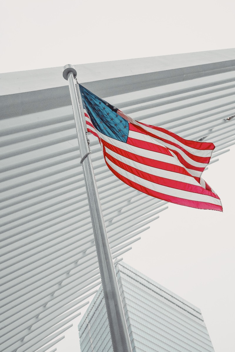
- Your design should appear on the 'obverse' side of the flag — the side you see when the flag pole is on the left. Most flags follow this principle. (Example: An embroidered American flag hanging in the White House.)
- Think About Ratio
- All good flags have a good ratio. The American flag has a ratio of 10:19; the Union Jack has a ratio of 3:5. What will yours be?
- Think About Symbolism
- What will your flag symbolize? Who will it symbolize? The images and patterns you choose should reflect this symbolism.
- Structure
- Your flag should be wider than it is tall. Avoid having a design on its reverse. The most important parts of the flag are in its center.
- Think About Color
- Red is the color used most for national flags. Using as few colors as possible keeps the design bold. Less is more.
- Avoid Text
- Because it defeats the purpose of a flag and is difficult to read when flying.
- Define the Edges
- The edges of your flag should stand out from its environment.
- Look to the Future
- Flags should be timeless. They need to unite people for centuries to come.
- Your Flag Needs to Blow in the Wind
- "Think what the flag will look like when flying in a brisk breeze and when hanging down on a still day," says the Joint Commission.
- It's All About TOTALITY
- "A flag should represent the totality of any particular community rather than individual parts of it."
Before You Design Your Flag There are many parts of a flag. Color. Structure. Symbolism. And how it blows in the wind. Consider these components when designing your own. Create one that unites and then go out and fly it.
This is by no means law when it comes to designing your flag, but rather a basic outline of what the most iconic flags, such as the American flag, offer. Designing a flag should be fun, but also take your time when designing one because you would want it to last for ages to come. Get your flag design going by starting your Custom Flag Order with us!